How to use media queries with styled components
TL;DR
Media queries with styled components work the same as in CSS!
const CardWrapper = styled.div`
  display: flex;
  flex-direction: row;
  @media (max-width: 768px) {
    flex-direction: column;
  }
`;
If you want a more involved example with defining different device sizes, continue below.
What we'll build
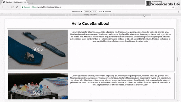
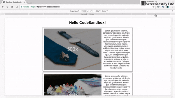
We'll start from a simple webpage that is not responsive and improve it wth media queries! Checkout the code on Code Sandbox.

So how to make it responsive using styled components?
- Define the breakpoints as a Javascript object
- Define the devices for each breakpoint using the usual media query syntax
- Apply the
@mediarules as usual in the styled components
#1 Define the breakpoints & devices
Let's create one breakpoint for each size used in the Chrome Dev Tools:
const size = {
  mobileS: '320px',
  mobileM: '375px',
  mobileL: '425px',
  tablet: '768px',
  laptop: '1024px',
  laptopL: '1440px',
  desktop: '2560px'
}
Then, based on the size, let's create a media query for each device supported.
Notice how the code uses just plain Javascript objects for this and taking advantage of ES6 template strings & string substitution.
export const device = {
  mobileS: `(min-width: ${size.mobileS})`,
  mobileM: `(min-width: ${size.mobileM})`,
  mobileL: `(min-width: ${size.mobileL})`,
  tablet: `(min-width: ${size.tablet})`,
  laptop: `(min-width: ${size.laptop})`,
  laptopL: `(min-width: ${size.laptopL})`,
  desktop: `(min-width: ${size.desktop})`,
  desktopL: `(min-width: ${size.desktop})`
};
#2 Update the components to adapt based on device size
The root of the application consists of the following hierarchy:
const App = () => (
  <Page>
    <Hello name="CodeSandbox" />
    <Card withPictureOf="cats" />
    <Card withPictureOf="coffee" />
    <Card withPictureOf="oranges" />
  </Page>
);
In other to make the page responsive, two components need to be updated:
- The
Pageneeds to have maximum width - The
Cardneeds to show the text beneath the image on small devices
For the page, this can be easily achieved by just specifing different max-width based on device:
import styled from 'styled-components';
import { device } from './device';

const Page = styled.div`
  margin: auto;
  font-family: "sans-serif";
  text-align: center;

  @media ${device.laptop} {
    max-width: 800px;
  }

  @media ${device.desktop} {
    max-width: 1400px;
  }
`;
And for the Card, it's a matter of updating the flex-direction:
import { device } from './device';

const CardWrapper = styled.div`
  display: flex;
  // Mobile friendly by default
  flex-direction: column;

  border: 1px solid gray;
  box-shadow: 5px 5px #ccc;
  padding: 10px;
  margin: 10px;

  // Switch to rows on large devices
  @media ${device.laptop} {
    flex-direction: row;
  }
`;
That's it!
The page now correctly updates based on the device size!
Do you still have questions about how to use media queries with styled components?
Let me know in the comments below.
Comments ()