How to use Semantic UI with a custom theme in your CRA app
Semantic UI is a fantastic UI library and the fact that you can use plain React components to compose your layouts makes it a great fit for React applications.
When it comes to customizing the styles though, it’s a whole different story. The docs are lacking any detailed explanations and you’re left figuring out things on your own.
Is theming Semantic UI React even possible? The answer is yes!
Understand Semantic UI React’s philosophy
Semantic UI React encapsulates the HTML and JS parts of the main Semantic UI Library.
It is only concerned with outputing the correct markup and behaviour but knows nothing of CSS.
This is why, when setting up your React app with the default theme, you need to also install the semantic-ui-css package - to add the CSS part into the mix.
This means you have full control over the CSS of your component. You could include it:
- using the default theme distributed in the official
semantic-ui-csspackage - from a CDN
- from a custom built CSS you generated using the main
semantic-uipackage
How customizing Semantic UI React works
As described in the official docs, in order to customize the default theme, you will need to install the Semantic UI package in your project.
This means you will get a copy of the entire UI library source code in your codebase. This is far from ideal, especially since the JS files are also included yet they will never be used.
You could work around this by creating a separate repo for the custom theme, or maybe try to use semantic-ui-less which only brings in the less files. I chose not to investigate these routes and just included the library as a dev dependency.
Installing the Semantic UI package
To install, you only need to run:
npm install --save-dev semantic-ui
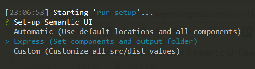
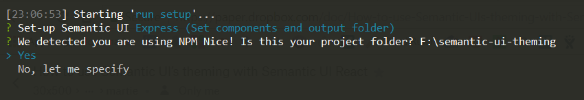
This will prompt an interactive installer that will allow you to configure your installation.
**Careful if you're using Yarn!**
Doing yarn install --dev semantic-ui will not work because Yarn does not support interactive prompt installs (see this Github issue]
The solution is to install it using npm and then run yarn install to update your yarn.lock file.
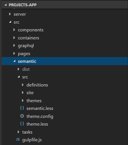
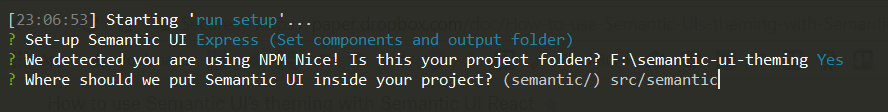
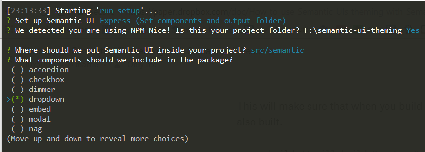
First questions are related to the type of installation and choosing the folder where to place the source code inside your project. I chose to put it under src/semantic.
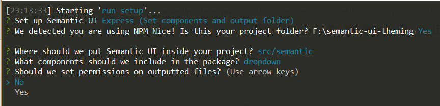
Then, you can choose what components you want to use:
When the installer finished, you will notice two new things in your project:
- a new
semanticfolder - this is where your theme & custom CSS will reside - a
semantic.jsonfile in the root of your project - a configuration file that keeps track of where semantic is installed, what the destination folder should be and other settings you input on installation
To wrap up, before you commit your files to the repo, you might also want to ignore the dist folder from source control:
// .gitignore
# production
/build
/src/semantic/dist
Building the custom styles
Now that the package is added to the project, how do you actually include it in your code?
First you need to build the files in the semantic folder and then include the generated CSS in your main application file.
Since this is not something you want to do manually do every time, let’s update the scripts in the package.json file to build the Semantic UI files.
Semantic UI uses gulp, so let’s first install that as a dev dependency:
yarn install --dev gulp
Then, in your package.json add the following lines:
  "scripts": {
    // Run configurations to build & watch the semantic folder
    "build-semantic": "cd src/semantic && gulp build-css build-assets",
    "watch-semantic": "cd src/semantic && yarn run build-semantic && gulp watch",
    // Updated start & build configurations to also keep an eye on the Semantic folder
    "start": "yarn run build-semantic && react-scripts start",
    "build": "yarn run build-semantic && react-scripts build",
    "test": "react-scripts test --env=jsdom",
    "eject": "react-scripts eject"
  }
Notice that in the build-semantic script, we only run the gulp build-css and build-assets tasks. That’s because we don’t need to built the whole UI library, but just its CSS and asset files.
To use this in development, start two console tabs and run yarn start in one of them, and optionally yarn run watch-semantic to also watch for changes to your theme files.
Include the built CSS file in your app
In your main App js file, add the following line to include the generated CSS file:
import './semantic/dist/semantic.min.css';
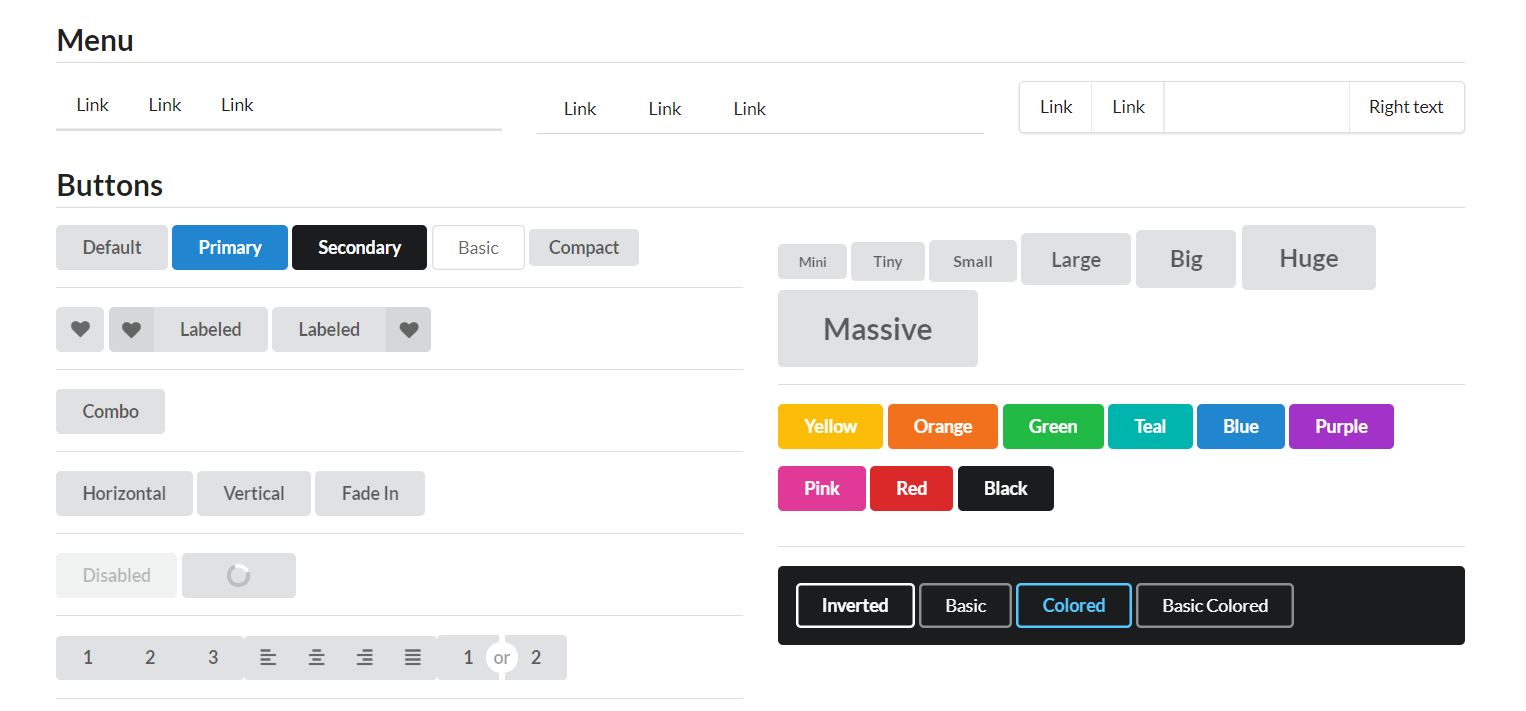
Then start the app and navigate to the browser;
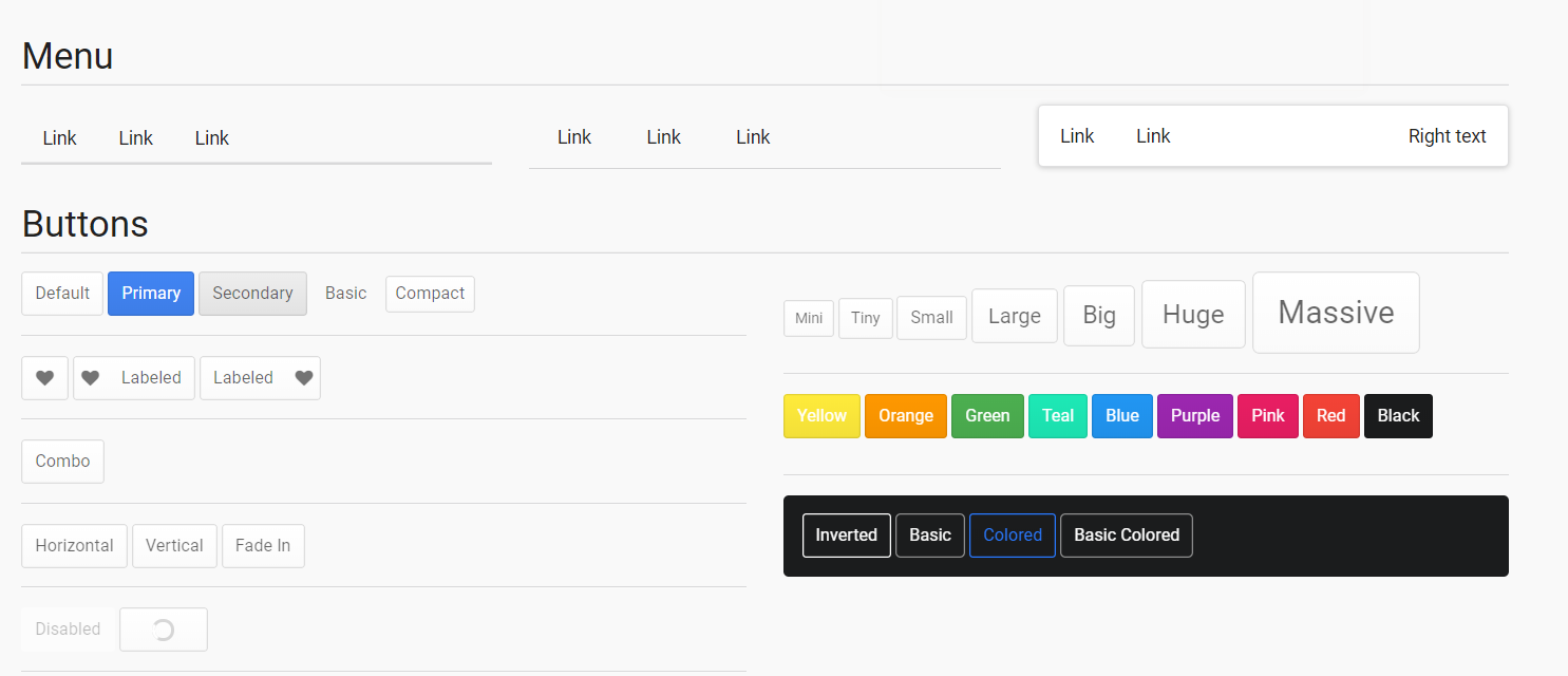
The sample app uses the markup from the Theming example in the Semantic UI docs.
Opening the homepage you should see a list of some Semantic UI components styled with the default theme!
Changing the theme
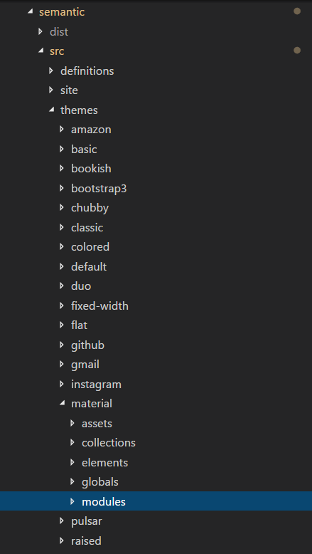
Now that everything is setup, you can go ahead and create a new theme for your project.
You would do that by creating a new folder in src/semantic/themes. For specific details on how to customize it, you can just follow existing Semantic UI tutorials. I found this one to be easy to follow (just keep in mind src/ in their examples corresponds to src/semantic in your React app).
For now, let’s just switch the theme to one of the existing ones - more specifically the Material theme:
// src/semantic/src/theme.config

/* Global */
@site       : 'material';
@reset      : 'default';
/* Elements */
@button     : 'material';
@container  : 'default';
@divider    : 'default';
@flag       : 'default';
@header     : 'material';
@icon       : 'default';
@image      : 'default';
@input      : 'default';
@label      : 'default';
@list       : 'default';
@loader     : 'default';
@rail       : 'default';
@reveal     : 'default';
@segment    : 'default';
@step       : 'default';
/* Collections */
@breadcrumb : 'default';
@form       : 'default';
@grid       : 'default';
@menu       : 'material';
@message    : 'default';
@table      : 'default';
You shoulnd’t change all the components to the new theme - just the ones that are actually implemented in the theme. In this case, the Material theme only implements “site”, “header”, “button” and “menu” overrides, so those are the ones changed.
If you open the app in the browser again, you will see the theme has changed!
Wrapping up
Changing the theme of Semantic UI in a React application is not really elegant yet, but it is possible.
If you liked this article, go ahead and star the Github repo with the source code:
What is your experience using Semantic UI with React?
Let me know in the comments below!
Comments ()