Creating a Twitter-like search component in React
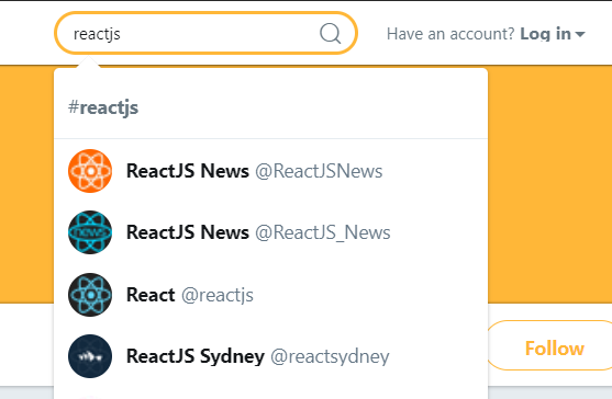
Think for example Twitter's search box. As the search results come in, a dropdown menu renders and user can select any of the items. How can I build this in react?
Let's try to built this kind of component! To keep things simple, I'll skip the styling and actually loading the data from the Twitter API, and instead focus on the "dumb" component for now.
Pick an already made component for this
These type of components are called “autocomplete” or “typeaheads”. Actually, there’s isn’t just one way to call them, as Kent Dodds was rightly pointed out a while ago:
What is one word that can be used to refer to the following components: autocomplete, typeahead, dropdown, select, and combobox?
— Kent C. Dodds 🧢 (@kentcdodds) August 15, 2017
So what options do you have? I managed to find 3 libraries that provide "autocomplete" functionality:
For the purpose of this tutorial, I’ll use Downshift.
Create a dumb component for your search box
This means you should first create a component that works as you expect and not be bothered by how you will get the data into it.
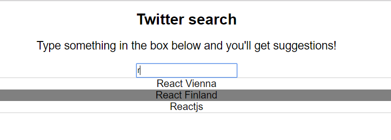
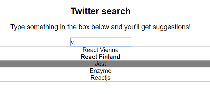
When we’re done, we want to have a component that we can use like this:
<SearchBox
          placeholder="Search for .."
          items={['React Vienna', 'React Finland', 'Jest', 'Enzyme', 'Reactjs']} />
.. and the output will look like:
So, without further ado, let’s get to building it :)
1. Add downshift to your project
yarn add downshift
2. Create a component named SearchBox
The component should accept as props:
- the list of
itemswe can search through - the
placeholderto show in the input before the user typed anything
// components/SearchBox/index.js
import React from 'react';
import Downshift from 'downshift';

const SearchBox = ({ items, placeholder }) => {
    return (
      // We need to put downshift here :)
    )
  }

export default SearchBox;
3. Add downshift
The way downshift works is that it gives us a prop called render into which we can pass a function describing how we want our dropdown to look. This is great news, as it means we have full control over the rendered HTML!
<Downshift
  render={(propsFromDownshift) => (
    <div>
      // We can render anything here and we have access to details about
      // the state of the component through `propsFromDownshift`
    </div>
  )}
/>
An autocomplete component usually consists of 3 parts:
- an input
- a container for showing the suggestions
- a suggested item
Let’s render those step by step. I’ll go over what props we use from Downshift as we go, but if you want to see a full list available, check full list of render props.
Adding the input
Since our search box is rather easy, we’ll just use an HTML input tag for searching:
<input type="text" />
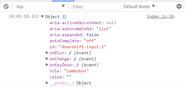
Downshift gives us access to a list of props we can add to our input through the getInputProps function passed into render.
Here’s what I mean by that:
<Downshift
  render={({ getInputProps }) => {
    console.log(getInputProps());
  }}
/>
If we want to add more props that the ones from Downshift, we can do that by passing them as arguments to that function:
getInputProps({ placeholder: 'Type here' });
So, let’s go ahead and add the input:
// components/SearchBox/index.js
import React from 'react';
import Downshift from 'downshift';

const SearchBox = ({ items, placeholder }) => {
    return (
      <Downshift
        render={({
          getInputProps,
        }) => (
          <div>
            <input {...getInputProps({ placeholder })} />
          </div>
        )}
      />
    )
  }

export default SearchBox;
Adding the container for showing the suggestions
We need a way to tell when the container is visible and when not - based on what the user typed in the box.
For this, we have access to a prop named isOpen inside the render function. Let’s use it to add a suggestions box to our component:
const SearchBox = ({ items, placeholder }) => {
    return (
      <Downshift
        render={({
          getInputProps,
          isOpen,
        }) => (
          <div>
            <input {...getInputProps({ placeholder })} />
            {isOpen ? (
              <div style={{border: '1px solid #ccc'}}>
                  // Our suggestions will go here!
              </div>
            ) : null} // Return null if the box isn't open
          </div>
        )}
      />
    )
  }
Showing the suggested items
This is the trickiest part of all so far, so I’ve annotated the code line by line:
const SearchBox = ({ items, placeholder }) => {
    return (
      <Downshift
        render={({
          getInputProps, // Props to pass to our input
          getItemProps,  // Props to pass into each of the suggested items
          isOpen,        // Whether the "suggestions box" is visible or not
          inputValue,    // Value that the user typed in the search box
          selectedItem,  // Item that is currently selected in the list (when hovering)
          highlightedIndex, // Index of the item currently selected in the list
        }) => (
          <div>
            // The search box where the user types
            <input {...getInputProps({ placeholder })} />
            {isOpen ? (
              <div style={{border: '1px solid #ccc'}}>
                {items // Items are passed in as a prop
                       //-> so it's a list of all elements, unfiltered
                  .filter( // that's why we first filter the list
                    i =>
                      // show item `i` if:
                      !inputValue || // the user didn't type anything in the box
                      // OR item `i` contains the text from the user (`inputValue`)
                      i.toLowerCase().includes(inputValue.toLowerCase()),
                  )
                  // then, for each filtered item ..
                  .map((item, index) => (
                    // output a <div> ..
                    <div
                      {...getItemProps({item})} // .. using the props from `render`
                      key={item}
                      style={{
                        backgroundColor:
                          highlightedIndex === index ? 'gray' : 'white',
                        fontWeight: selectedItem === item ? 'bold' : 'normal',
                      }}
                    >
                      {item} // .. and containing the name of the suggestion
                    </div>
                  ))}
              </div>
            ) : null}
          </div>
        )}
      />
    )
  }
That’s it!
You should be able to use the component in your app by just passsing in a list of items and a placeholder! And of course, you should probably tweak the styling a bit :P
You can also find the full source code on Github.
Comments ()